Orgvue June 2026
We're rolling out several improvements to bar charts this month.
New percentage labels for bar charts
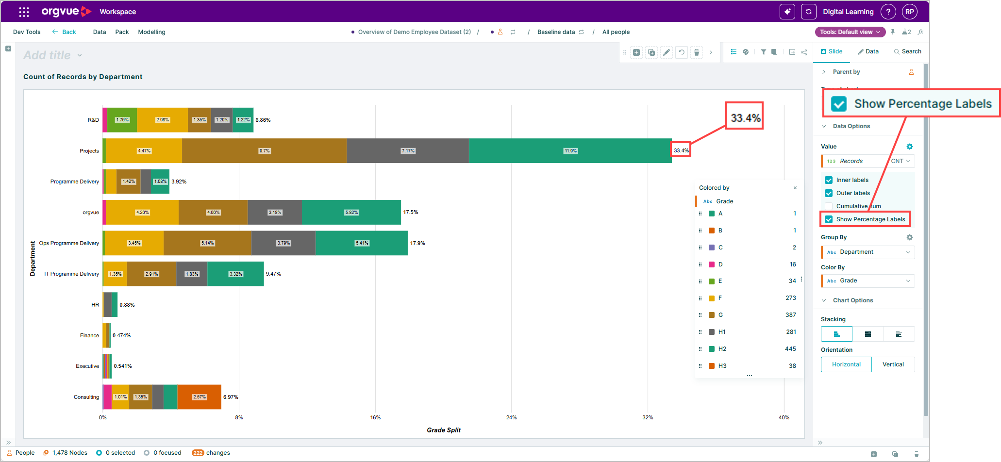
You can now show percentage labels directly on bar charts.
This makes it easier to present proportional data and see how each segment contributes to the overall total.
Improved axis title editing
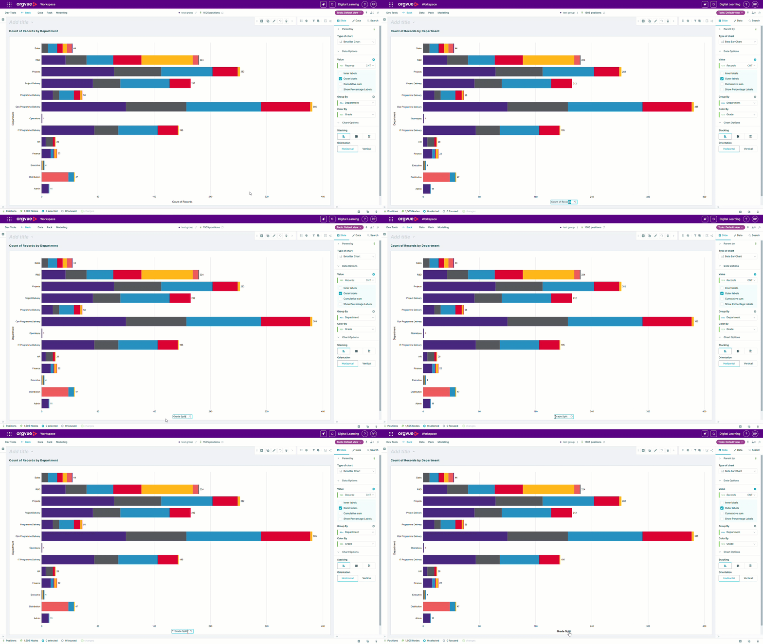
Axis titles are now easier to update and format. Double-click an axis title directly on the chart to edit it, then press Enter to save.
You can also apply bold, italic, or bold italic formatting—making your labels clearer and more presentation-ready.